Posted on

Stepping into the Acrylic world

AcrylicForestRain

Been a little quiet in posting lately, but that doesn’t mean I haven’t been crazy busy. The last post was during the Winter Holidays, and that was also the one-year mark of trying to figure out what on earth was going on in my body that caused me to lose vision. After many tests, and changing several doctors, we finally have a diagnosis.

Ankylosing Spondylitis.

Or “Bamboo Spine”

Not exactly the best news, but it has given us a direction on medications to try out. When numbers jumped up around the holidays, I made the difficult choice to keep my immune-compromised son home from kindergarten until he was vaccinated. Trying to increase my work hours, covid, a 5 year old, and finding out my spine was trying to become a solid was a lot to handle. But it was also a time to be at home and learn something new, make something beautiful for my son to see.

I was gifted some canvas, and acrylic paints for Christmas! I was very excited, and yet nervous to start. I knew I would love them, but I also knew that it would be very, very expensive compared to watercolour painting. Kind of like how many artists keep piles of ‘good paper’ around because they don’t want to ‘waste it’ on learning. PIIIISH-SHAW! Get into all your supplies, and don’t hold back for a moment! Our learning journey is as messy as our lives, but that’s what makes it wonderful.

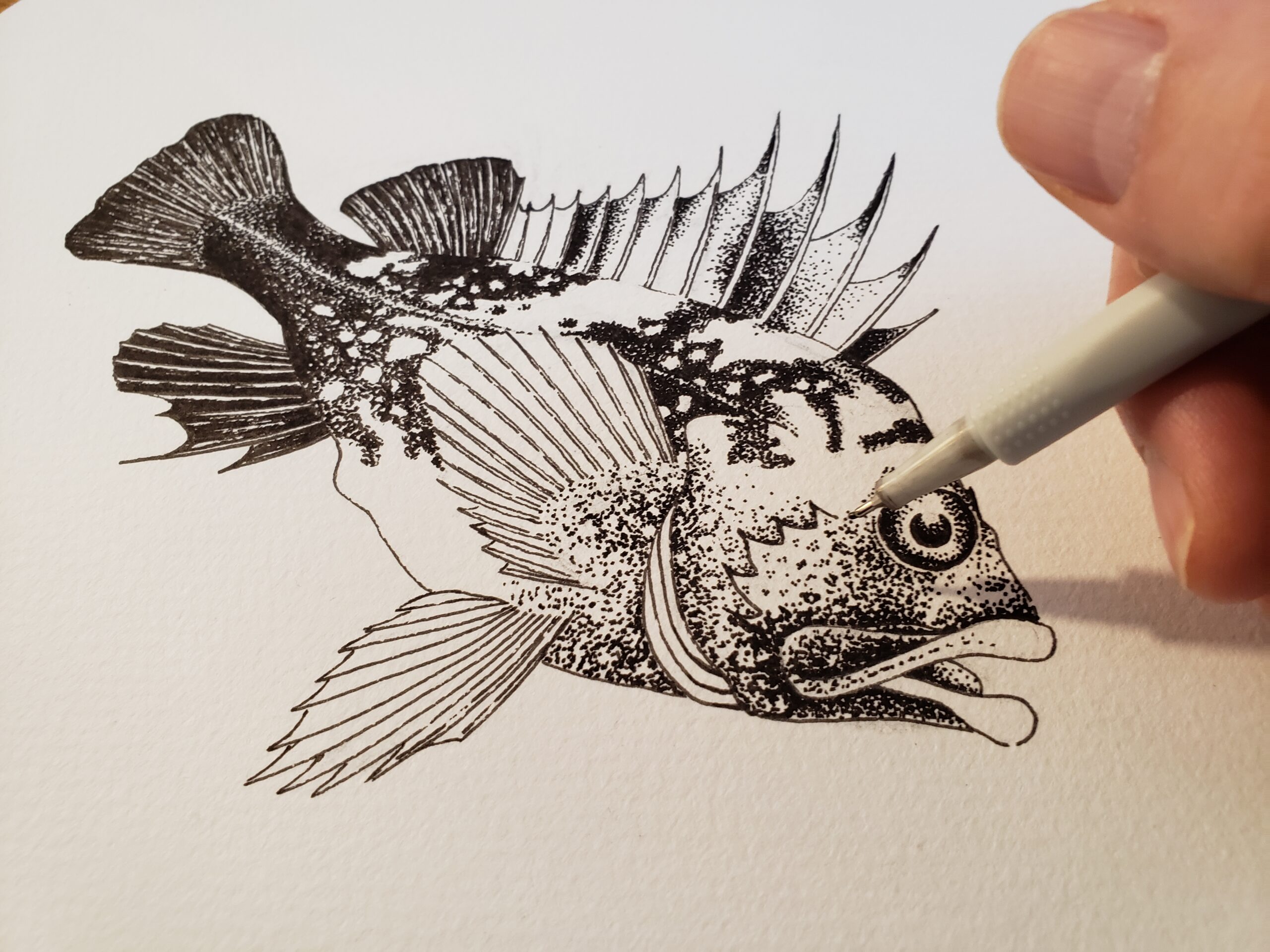
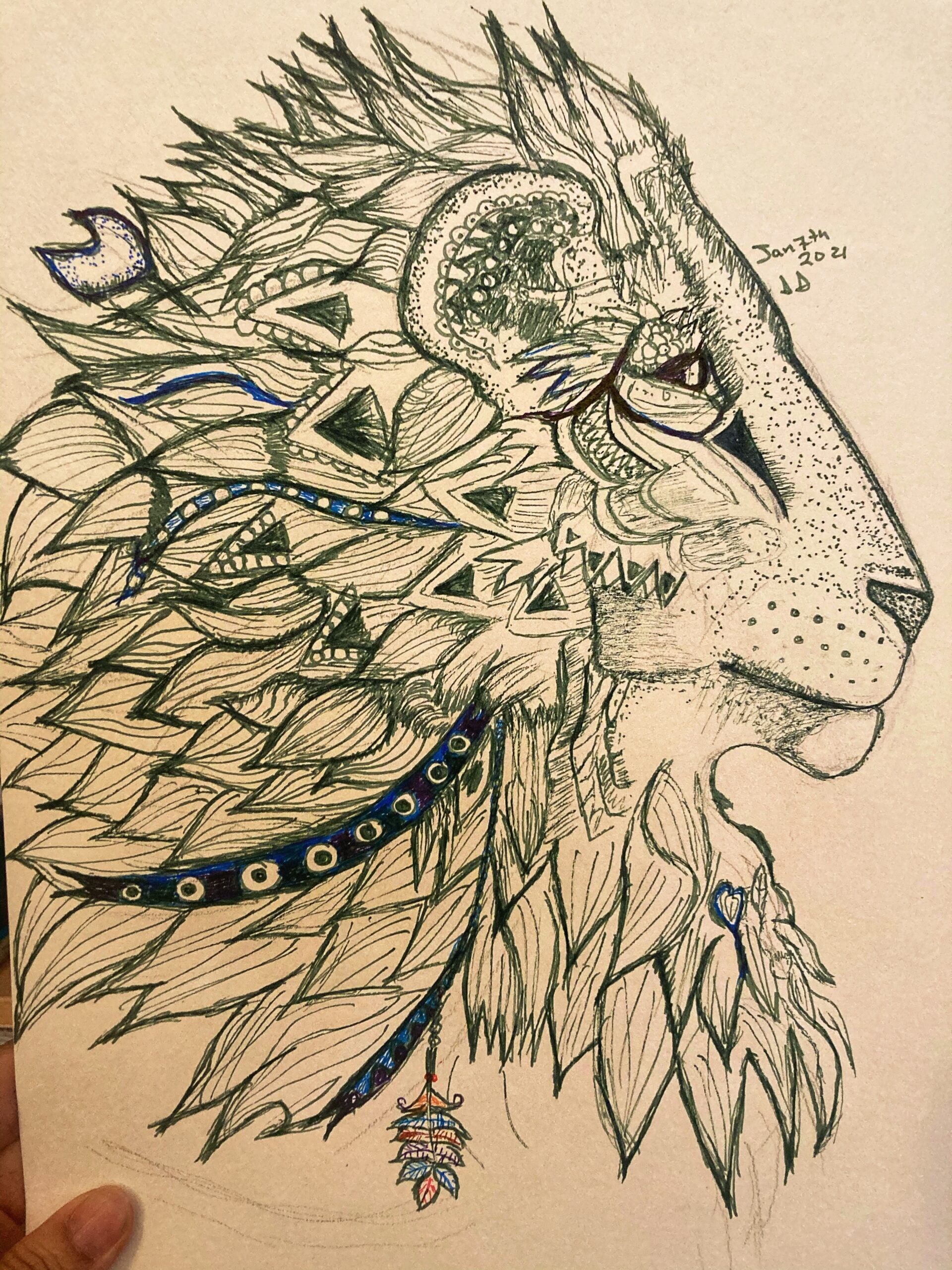
I still haven’t had a chance to take a real art class, one day I hope to. It would be great to learn about brushes, angles, and strokes from another human. I’m one of those, “I need to ask questions to learn things” kinda gal. Instead, I turned to what everyone does, the youtubes.
The first thing I learned (through trial by fire) was that watercolour supplies DO NOT always work with acrylics. The first few canvas creations were a dripping horrible Dr. Suess mess, but I did learn a lot! After that, I found a few artists that used household items to paint, and that really helped me.

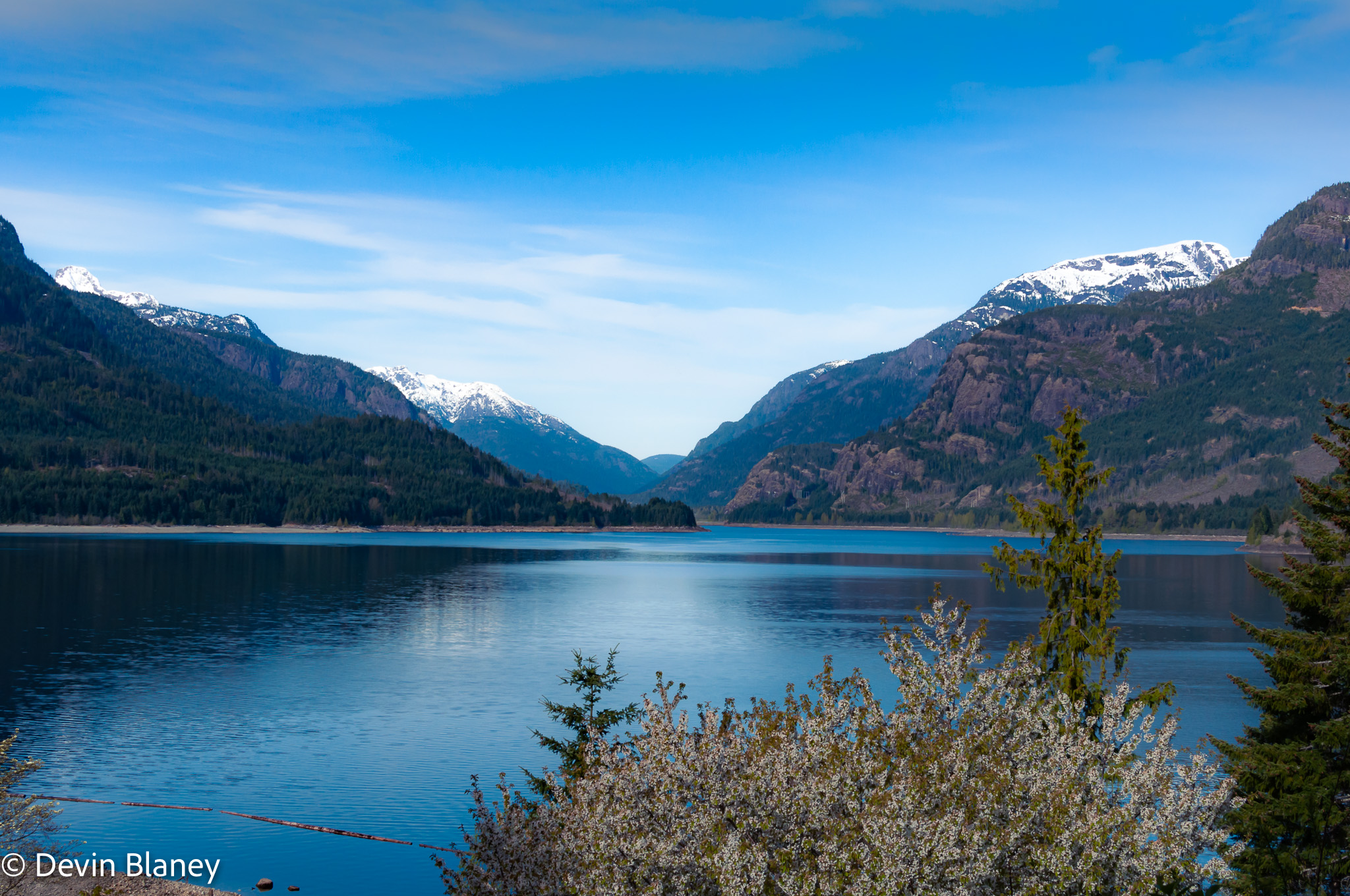
Now I feel more confident trying whatever works to get my art onto canvas. I started painting a ‘wet coast’ series. Living in Vancouver is beautiful! It rains a lot, but it’s why our forests are so vibrant and lush. In these paintings, I wanted to try and capture a beautiful moment.

I’m really loving acrylics, and I can’t wait to learn more!

Posted on

Loose Flowers

Winter seems to be having an off and on again relationship with the West Coast right now. Is it really over between us? Are we ready to move on? Just when we think it’s over, winter comes barreling back into the room yelling, “AND ANOTHER THING!”

I’m ready for spring! I’m ready for being outside again!
Have you heard of loose flowers before? Neither did I until I started researching! They are beautiful and simplistic. The MOST challenging part? The ‘proper’ way to paint these is to only use 1 or 2 brush strokes per petal. It is almost maddening to me to consider something is good enough with just one or 2 strokes! The perfectionist in me is incredibly conflicted. I want to make it perfect! To do it correctly, you can only do it once! Still, it has changed my perspective on painting yet again, and I have truly enjoyed learning about this style.

Posted on

Sebastes maliger

Quillback Rockfish

A couple months ago, I thought I would start a completely new, completely different approach to my illustrating. I was hoping to create a series of minimalistic, almost cartoonish, yet proportionately and scientifically accurate portraits of local marine species. The ones I grew up with.

My challenge was to embrace a combination of line art and stippling, using a single .03 generic black felt-tip pen on medium textured cold press Fabriano watercolour paper. Although I feel quite comfortable with line art, I really wanted to focus on the dots! Stippling is a completely new concept to me.

AND when I’m finished, I will finally make prints available! Just a few. I’ve found a wonderful local printer to work with to make a limited run of each species I complete.

I’m pretty excited to share these. I’ve completed a few already, you can check some of them out in the Shop, and I’ll be posting new species posts in the coming days. The series is called Native Marine Aquatics of the Pacific Northwest. I’ve had a great time doing this little study so far. Lots of beautiful species still to cover. So here I go.

One of my absolute favorite local species is the Quillback Rockfish. One of 36 different species of Rockfish belonging to the genus Sebastes found in Canada’s Pacific waters, and one I saw on the regular while fishing the waters off Pender Island as a child.

The name, sebastos, is Greek for ‘magnificent’ referring to their remarkable, almost tropical appearance. This genus is filled with colourful cousins, many of which I hope to illustrate in the future.

The Quillback’s species name comes from the Latin words malus and gero meaning ‘mast’ and ‘to bear’, which basically translates into “I bear a mast” ..very apt.

Reaching a maximum size of 20 inches or so, the Quillback Rockfish sports 13 wickedly sharp spines with venomous glands at the base of each. The poison is not strong enough to kill you, but definitely a painful and itchy experience. The poison is however an effect anti-predator adaptation.

Like most other Rockfish they are slow to reach maturity (around 11 years) and can grow to be very old. The oldest Quillback Rockfish was a Canadian, with an impressive lifespan of 76 years. Females tend to grow larger and older than males and give birth to live young (viviparous).

Considered an ‘inshore’ rockfish, Quillback live alongside yelloweye rockfish (S. ruberrimus), copper rockfish (S. caurinus), China rockfish (S. nebulosus), black rockfish (S. melanops) and tiger rockfish (S. nigrocinctus).

Quillback Rockfish are solitary, minimally migratory, and are very localized in where they live, so they are particularly vulnerable to overfishing. Thankfully a network of protected Rockfish Conservation Areas have been created.

I really think I achieved the accuracy I set out to capture, while retaining a bit of my own cartoonish style. I hope you like it. I’m quite happy with the results.

– Aaron.

Posted on

Try All The Things!

InkedLionGreen

It’s a new year! Time to cast off the dreadful shackles of 2020 and try out new things. No one saw how big the events of last year were going to hit us. We’ve all had to make some pretty big changes and sacrifices. I know the turning of a calendar page won’t change the world, but it does bring hope, and sometimes that’s all you need to get through to the next calendar page.

Rightly Spoiled this holiday

I haven’t been able to work this school year, as we’re home keeping my son safe. This holiday was set up to become smaller and quieter. I was thinking of just postponing it completely as my little one is still young enough to not know when Christmas was. My cousin Sally nominated our family to the wonderful people at Vibrant Yogi, who teamed up with Living Water’s Church in Langley to gift us this generous pile of treasures. Kelsey made our Christmas, and I’m ever thankful for all the work and kindness people showed our family.

My little guy was gifted many transforming robots and superheroes! I was blessed with new art supplies and I just had to start trying all the new things. Obviously, someone must have been an artist looking for supplies because include were things I always wanted, but never got for myself! Brushes, tons of paper, tape, and new metallic paint!

My first piece using metallic gold to highlight the black ink


I delved into the land of ink! I became incredibly fixated with these 2 lions. The 1st in forest green, the 2nd in navy blue.

For 4 days straight, all I wanted to do was work on these pieces. It was very freeing to try something new and outside of my regular style of expression through watercolour. I’ve highly enjoyed it, and I see why Aaron Schallie enjoys the details that you can create. It was easy to get into a quiet zone during these dark chilly days and let the hours slip by into the ink and paper. I fairly excited to try many more new things and try out all the supplies! It almost feels like starting all over again.

Posted on

First Post

The image above is one of a series of 174 shots taken daily over a season, covering 215 days

Start, just do it!

Hey there! Devin here, pleased to meet you and thanks for dropping by.

I’ve been using cameras to record what I have witnessed for over 30 years, and then done nothing with them ever again, both from film and digital. Until now! Now I begin on my journey of developing and showing my favourite photos from years past and present. I am also learning how to develop RAW images as I go through my shots; I expect a steep learning curve ahead.

I have recently realized that my photo taking was a form of meditation; seemingly practiced by my subconscious mind. This is likely why I gained so much enjoyment from taking pictures even without ever following through with the images in any meaningful way. Conversely, this growing body of untended work, had become a form of shame and stress itself, somewhat countering the benefit of the practice of taking the photos.

So please, join me as I expand my practice to include the following through and development of the images. I present my first attempts at development, four shots from two spots worlds apart:

These are two images of the same sunset, taken on my first night on the coast of Oaxaca, Mexico

This is a heavy crop of another image from the daily series, this time focusing on the clouds interacting with the trees


Thank you for sharing this experience

-Devin

Posted on

Holiday Cards!

The season of winter bliss is upon us! A lot of friends have been asking if I am going to create holiday cards. The tricky part is making them affordable to purchase multiples. I’m currently working on a possibility.

Winter holidays tend to carry so much meaning and emotion that I found this project daunting. What do people celebrate? How can I put that into paint? How do you capture the feelings that people have? Trying to paint for what someone else wants became baffling. and I had to stop. I had to just paint what I felt and hope people enjoyed it.
For me, the winter holidays are about family. Pretty vibrate colours among the white winter snow, and hope for the sun and light. And of course, a Peanuts Christmas. 🙂

I have found a lot of winter scenes quite challenging, as they are often bright from reflection and painting light continues to be a challenge for me. So far, these are my collection! Let me know what you think!

Posted on

What Is Remembered, Lives

Remembrance Day Field

Remembrance Day has always held a very special place in my heart. Our family is incredibly grateful for the ability to live in a country where we feel safe, women can go to school, and we know we can be taken care of if things become terrible. All of that, every right we live in was fought for, and defended.

Our resident blacksmith Russ completed his first Remembrance Day Poppies last week as well! Check out his work here! It’s absolutely beautiful.

This piece features 2 lonely graves under a strong, vibrant tree. On the right 2 soldiers continue their walk forward. Are they comrades? Are they the soldiers who now rest under that tree?
Mostly, I enjoy art that tells a story, and makes you feel something. If I’ve inspired an emotion with this piece then I hope it touches your heart.

Posted on 2 Comments

Poppies in the Fall

A project of remembrance

Poppies have played a role in my life since I was old enough to remember my first Remembrance Day ceremony in elementary school. Since then, those bright red, flocked plastic poppies have held a special place in my heart.

They are a fleeting thing. Seen first on November 1st on counters across the country. Worn proudly until the 11th hour of the 11th day on the 11th month when they are left on cenotaphs, memorials and gravestones throughout the British Commonwealth. I will always wear that little piece of plastic and buy one each year.

That said, I have often thought that something more tangible – beautiful even – and permanent would be a more appropriate marker for veterans.

This morning, the family got together at Valley View Cemetery for the moment of silence at 11am and to leave these tokens as our thanks.

I learned about the various colours of patina that copper was able to achieve with different chemical treatments. Blue, green, aqua and surprisingly enough, red! When heated coper is quenched in a solution of boric acid (Borax) and water, the coper is coated in a smooth dark red colour. Outstanding! The right colour, the right amount of permanence and some beauty thrown in for good measure!

Patterns are cut out of sheet copper and are textured with the narrow end of a light cross peen hammer. The texturing serves two purposes: to create a pattern more interesting and organic than flat sheet and to thin and define the edge of each petal.

Texturing of the pistil was accomplished with a round punch. this is purely to give some definition to the center. Following texturing, the pistil was rounded with a dapping block and punch to match.

From there, assembly! A little borax flux, a little silver solder and there you have it! Quenching the assembled poppy in the borax solution after each annealing built up the layers of colour. Some turned out much better than others, but with some repetition, I think they all turned out great! After I got the colour I was looking for, I scrubbed off any of the patina from the pistil and blackened the raw copper with a solution of liver of sulfur (potassium sulfide) and water.